Effective data management has become an increasingly significant determiner of organizational success. While many nonprofits are now collecting data regularly –90% according to a report by NonprofitHub and EveryAction – many remain unsure of what to do with it after it’s been recorded. Salesforce.org’s recent Nonprofit Trends report shows that fewer than half of nonprofits report using analytics to interpret their data. Since data analysis is imperative for nonprofits who wish to create value from data collected, we’re breaking down everything you need to know to improve performance insights using Salesforce’s native analytics tools.
Introduction to Reports and Dashboards
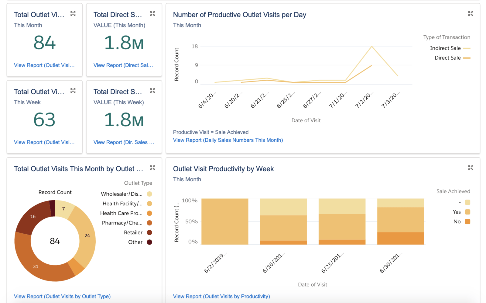
Salesforce Reports and Dashboards work together to offer a simple, out-of-the-box analytics solution for nonprofits using Salesforce. A Report is a list of records, such as contacts, projects, or accounts, that meet a defined criteria. You can easily filter, group, summarize, and drill-down on data within reports to answer specific questions about your programs and inform decision-making. Using Many2Many for tagging related data points, you can also report on ‘junction records’, such as the frequency of themes, SDGs, or geographies across projects or Opportunities. This provides a nice way to avoid the horrors of trying to report on multi-select picklists.
Coupled with the right data model and strong data management practices, reports help organizations answer important questions around their program reach, delivery, thematic and geographic breakdown of beneficiaries, cost-effectiveness, and outcomes.
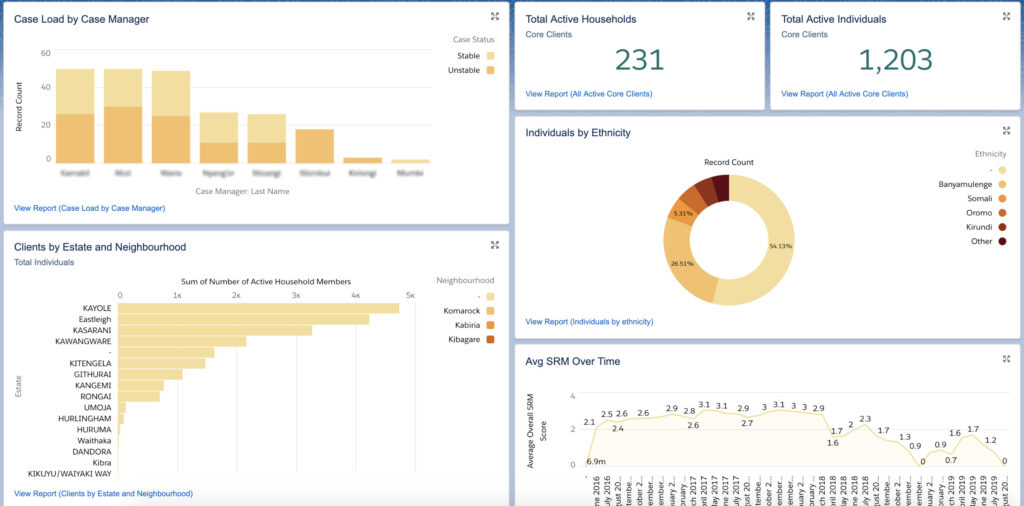
Salesforce Dashboards provide a space to visualize data from one or more Reports in order to identify trends over time and monitor performance routinely. Each dashboard component is displayed as a metric, table, gauge, or chart (including pie, bar, line, or funnel chart), and Dashboard Filters can be applied to dynamically filter all the components at once (e.g. by country, period, or funder).
5 Tips for Using Salesforce Analytics to Inform Decision-making
For-profit and nonprofit Salesforce users alike use Reports and Dashboards on a daily basis as a pulse check for their organization’s performance measures. Here are five tips to ensure you get the most out of your organization’s Reports and Dashboards:
1. Ask the correct questions
Start by jotting down the critical questions your organization needs to answer routinely. Make sure that the answers to your questions will add value to our organization.
2. Decide who needs the information
Once you’ve decided on critical questions that can be asked of the data, decide who needs this information. This will guide your decision on who gets access to specific Reports and Dashboards. Remember, overwhelming people with too much data or too many Dashboards will cause disengagement with the tool; it’s best to ensure that people only monitor what’s most important to them.
3. Determine frequency
Decide how frequently Reports and Dashboards should be updated and sent to relevant users. Ensure that data in the system gets captured or updatedby this time – so that the information presented is up to date!
4. Don’t overload Dashboards with non-critical information
It’s important to remember that a Dashboard serves to provide a snapshot of critical measures to inform decision-making. Dashboards users must think carefully about what information is necessary to include and how best to visualize it. Remember: decision-making should be helped, not hampered, by the data represented in your Dashboard.
5. Involve end users in data analysis
Don’t forget to feed data and insights from the Dashboard back to the folks who collect, capture, and manage the data day-to-day! Feedback loops are essential to keeping staff motivated and data quality high. Dashboards aren’t just for board members and executives – make them accessible from the field to the headquarters.
To dig a bit deeper, check out the Trailhead Module on Reports and Dashboards for some interactive exercises or watch last month’s Webinar on Lightning Reports and Dashboards.